
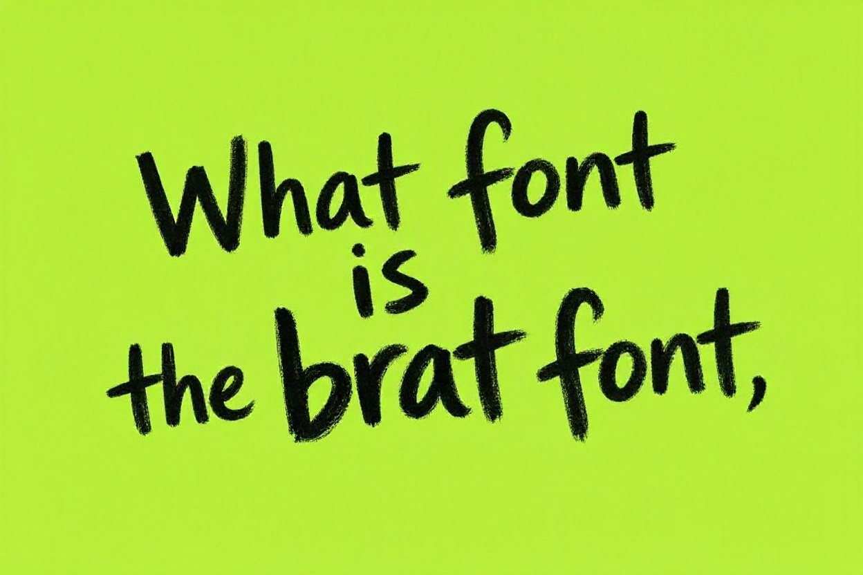
What font is the brat font? The visual style connected with Charli XCX’s <strong>BRAT</strong> era is often called the “brat font,” but it is not simply one universally named font that people can download and use without context. The look is defined by a blunt, low-effort, internet-native approach: lowercase lettering, plain sans-serif type, awkward spacing, simple composition, and a distinctive lime-green background. Its power comes from feeling deliberately unpolished rather than traditionally beautiful. People searching for the brat font usually want to know the exact typeface, how to recreate the style, and whether they can use it in their own designs. This guide explains the font’s identity, the traits that make it recognizable, practical alternatives, design rules, common errors, and smart ways to create a brat-inspired look without copying a campaign too literally.
What The Brat Font Actually Means
The brat font is best understood as a visual treatment rather than a single, fixed font file. The original album artwork uses an intentionally basic, slightly distorted lowercase wordmark that became central to the album’s online identity.
1. It Is Not A Traditional Display Font
A display font is usually designed to be eye-catching through decorative letterforms, dramatic contrast, or unusual shapes. The brat style moves in the opposite direction. It feels ordinary, utilitarian, and almost careless at first glance, which is exactly why it stands out.
2. It Uses A Simple Sans-Serif Foundation
The letters resemble a plain sans-serif typeface with rounded, neutral forms. Sans-serif fonts do not have the small finishing strokes found on serif letters. This makes the brat font style feel direct, digital, and suitable for bold text on a flat background.
3. It Relies On Lowercase Letters
Lowercase lettering is one of the clearest signals of the brat look. It creates a casual, conversational mood and avoids the polished authority of uppercase typography. Keeping the text lowercase also makes a short phrase feel more like an online comment than a formal headline.
4. It Includes Deliberate Imperfection
The wordmark does not look carefully typeset in the usual commercial sense. Its slight blur, stretch, or softened edges make it feel unstable and immediate. That imperfection is a design choice, not a technical mistake to remove automatically.
5. It Works With Minimal Layouts
The brat font style does not need complex illustrations, gradients, or decorative borders. A single phrase placed in the center of an uncluttered field can carry the whole design. The emptiness around the text becomes part of the message.
6. It Became A Cultural Shortcut
After the visual campaign spread across music, fashion, memes, and social media, “brat font” became a shorthand for a specific attitude. It suggests confidence, messiness, irony, nightlife, and a willingness to reject overly polished branding.
7. It Depends On Context
Using a similar typeface by itself will not automatically create the brat look. Color, scale, alignment, spacing, and the surrounding visual environment matter just as much. The full effect comes from several restrained choices working together.
Why The Brat Font Style Became So Popular
The popularity of the brat font style shows how simple design can become memorable when it matches a strong cultural moment. It was easy to recognize, easy to imitate, and flexible enough for people to remix.
1. It Breaks Polished Branding Rules
Many brands try to look refined, premium, and perfectly controlled. The brat aesthetic does not. Its roughness feels refreshing because it rejects the pressure to make everything elegant. That contrast helped it cut through feeds full of carefully curated content.
2. It Is Easy To Recreate
People could make their own versions with basic design tools and a common sans-serif font. This low barrier encouraged fan edits, jokes, event graphics, and personal posts. A style that is simple to imitate can spread very quickly.
3. It Feels Native To Internet Culture
Online language often values speed, informality, inside jokes, and intentional awkwardness. The brat font style fits that environment because it looks like something made for the internet rather than something adapted from a traditional advertising campaign.
4. It Creates Strong Recognition
The lime-green field and small dark wordmark are easy to identify from a distance. Strong recognition does not always require detail. In fact, fewer elements can make a design easier to remember when those elements are distinctive.
5. It Invites Participation
A complicated visual identity can make people feel like outsiders. The brat aesthetic gives people permission to participate. They can change the word, use a related color, or make the layout intentionally rough while still referencing the broader cultural language.
6. It Has An Emotional Point Of View
Good design is not only about readability. The brat font communicates an attitude: bold, unserious, direct, impulsive, and self-aware. That emotional clarity is why the style became more than a typography trend.
7. It Proves Simplicity Can Be Strategic
Minimal design is not the same as doing very little. The brat visual identity shows that a simple concept can be highly strategic when the typography, color, timing, and message all reinforce the same point of view.
Key Features Of The Brat Font Look
Several visual details separate a brat-inspired design from an ordinary poster using lowercase text. Paying attention to these factors helps the result feel intentional instead of accidental.
- &lt;strong&gt;Lowercase wording:&lt;/strong&gt; Use lowercase letters for a relaxed and conversational feel. Uppercase text often looks too loud, corporate, or formal for this particular style.
- &lt;strong&gt;Neutral sans-serif letters:&lt;/strong&gt; Choose clean, plain letterforms instead of decorative, handwritten, luxury, or futuristic fonts. The type should feel common enough to become interesting through context.
- &lt;strong&gt;Centered composition:&lt;/strong&gt; A centered phrase often captures the original balance. However, the text does not need to be perfectly centered; a slight shift can support the imperfect mood.
- &lt;strong&gt;Large empty space:&lt;/strong&gt; Let the background breathe. Filling every corner with text, stickers, or icons weakens the stark simplicity that makes the style work.
- &lt;strong&gt;Unexpected color contrast:&lt;/strong&gt; A loud green background with dark text is strongly associated with the era, but the broader principle is high contrast and a color choice that feels slightly abrasive or surprising.
- &lt;strong&gt;Softened or distorted text:&lt;/strong&gt; A modest blur, stretch, or low-resolution quality can add character. Keep the effect subtle enough that the words remain readable.
How To Recreate A Brat-Inspired Font Style
You do not need specialized software to make a brat-inspired graphic. The important part is making deliberate choices and resisting the urge to over-design the result.
1. Choose A Short Phrase
Start with one to four words. The style is strongest when the message is concise and immediate. A long sentence introduces line breaks, hierarchy issues, and extra visual clutter that can make the design feel more like a poster than a brat-inspired statement.
2. Pick A Plain Sans-Serif Font
Look for a neutral grotesk or neo-grotesk sans-serif font. Fonts such as Arial, Helvetica-like options, or other straightforward sans-serifs can provide a useful starting point. Avoid selecting a font just because it is unusual; plainness is part of the appeal.
3. Set The Type In Lowercase
Write the phrase in lowercase and test it at a modest size rather than making it enormous by default. The original visual language often lets the large color field carry the energy while the text sits with unexpected restraint.
4. Use A Flat Background Color
Choose one strong flat color for the background. Bright chartreuse or lime green is the closest reference point, but a different intense color can create a fresh interpretation. Avoid gradients, patterns, shadows, or detailed textures unless there is a clear creative reason.
5. Adjust Spacing Carefully
Check the letter spacing and word spacing at actual viewing size. The phrase should feel slightly compressed or casual, not mechanically perfect. Small spacing changes can alter the mood more effectively than adding filters or extra design elements.
6. Add Imperfection Sparingly
If the text feels too clean, add a very light blur, distortion, or compression effect. The goal is to suggest a rough digital texture, not to make the phrase unreadable. Always test the result on both desktop and mobile screens.
7. Remove Unnecessary Elements
Before publishing, delete anything that does not support the message. Extra logos, icons, captions, frames, and decorative shapes often dilute the aesthetic. In this style, restraint is more useful than adding another visual feature.
8. Check The Cultural Reference
A brat-inspired design can be playful, but it should not pretend to be an official release or use protected campaign assets without permission. Make your wording, composition, and purpose clearly your own, especially for commercial work.
Fonts That Can Create A Similar Brat Feeling
There is no perfect substitute because the brat font is partly about treatment and context. Still, several categories of fonts can help create a similar plain, direct, lowercase effect.
1. Arial And Arial-Like Sans-Serifs
Arial is not glamorous, and that is useful here. Its familiar shapes can support an intentionally ordinary visual approach. Adjust the size, weight, and spacing rather than expecting the font alone to provide the entire personality.
2. Helvetica-Style Grotesks
Helvetica-like fonts are clean, balanced, and visually neutral. They work well when you want a simple wordmark that does not compete with the color field. A slightly heavier or softer weight may better match the desired bluntness.
3. Inter And Modern UI Fonts
Modern interface fonts such as Inter can create a clean digital base. They may look more polished than the original style, so consider reducing precision through placement, spacing, or a subtle low-resolution treatment rather than using heavy effects.
4. Akzidenz-Grotesk Influenced Fonts
Grotesk typefaces often have an everyday, industrial quality that suits a brat-inspired composition. Their shapes can feel slightly less polished than newer corporate sans-serifs, helping the text retain a rawer and more editorial character.
5. Plain System Fonts
System fonts can be surprisingly effective because they are familiar and unpretentious. If a typeface looks too intentionally fashionable, it may undermine the concept. A basic font can be the better choice when paired with confident color and spacing.
6. Rounded Sans-Serifs
A subtly rounded sans-serif can work if it does not become cute or playful. The aim is softness without sweetness. Test the phrase carefully, since rounded letters can shift the mood toward children’s branding if they are too exaggerated.
7. Custom Distortion Over Font Hunting
Many people spend too long trying to identify one exact font. In practice, adjusting a basic font often gets closer to the desired result. Slight scale changes, blur, and placement usually matter more than finding an obscure typeface.
Common Brat Font Mistakes To Avoid
A brat-inspired design is simple, but simplicity makes every choice more visible. Small mistakes can quickly make the work feel generic, copied, or difficult to read.
1. Copying The Original Too Closely
Using the same color, exact wording pattern, and nearly identical placement can look like imitation rather than inspiration. Borrow the design principles instead: direct type, minimal composition, and confident contrast. Add your own phrase, color approach, or contextual idea.
2. Choosing An Overly Decorative Font
Script, bubble, horror, luxury, or novelty fonts fight against the style’s plainness. The brat font effect comes from ordinary-looking letterforms used with unusual confidence. Let the mood come from composition, not decorative type details.
3. Adding Too Much Graphic Decoration
Stickers, emoji, gradients, photo collages, sparkles, and ornamental borders can turn the design into a different trend. If the phrase needs more impact, improve the contrast or shorten the wording before adding visual extras.
4. Making The Text Too Small To Read
A small wordmark can be effective, but it still needs to be legible on a phone screen. Preview the design at reduced size. If readers cannot identify the phrase quickly, reduce distortion or increase the text size slightly.
5. Treating Blur As The Whole Style
A strong blur does not automatically create a brat-inspired design. Too much blur makes the text look like a technical error. Use distortion as a finishing touch after the background, font choice, spacing, and composition already feel right.
6. Ignoring Accessibility
High contrast is helpful, but harsh color combinations can still cause strain. Make sure the text remains readable and that important information is not communicated only through color. For announcements, include clear details in accompanying text where appropriate.
7. Using It For Every Message
The brat style has a specific tone. It may suit party invitations, playful social posts, music-related visuals, and bold campaign moments. It may be a poor fit for sensitive notices, detailed instructions, formal business communication, or trust-heavy messages.
Best Practices For Brat-Inspired Typography
The most successful brat-inspired designs feel simple because the creator has made careful decisions behind the scenes. These practices preserve the recognizable energy while keeping the work useful and original.
1. Let The Message Lead
Choose words that match the style’s blunt, casual voice. A concise statement will look more natural than a long, explanatory phrase. If you need to communicate complex information, use the brat-inspired visual as a headline rather than the complete information system.
2. Build Around One Main Contrast
Decide what creates the tension in the composition: loud color and quiet text, rough texture and clean layout, or small type and large empty space. One strong contrast is usually more effective than several competing visual ideas.
3. Keep The Type Treatment Consistent
If you use lowercase, soft blur, and tight spacing on the headline, avoid pairing it with ornate secondary type or formal serif body copy nearby. Consistency makes even a deliberately messy visual feel purposeful and easier to trust.
4. Create Your Own Color Version
The familiar lime green is culturally powerful, but it is also closely tied to the original campaign. Developing a different high-impact palette helps distinguish your work. Try an acidic yellow, hot pink, bright orange, or electric blue with strong dark text.
5. Test On Social Platforms
A design that looks balanced on a large artboard may fail when cropped into a profile image, story, or square post. Test the graphic in the format where it will appear and make sure the phrase remains readable at a glance.
6. Use The Style As An Accent
A brat-inspired card can work well as one slide in a carousel, one event teaser, or one visual moment in a larger campaign. Using it selectively keeps its impact strong and prevents the overall communication from becoming visually repetitive.
7. Respect Ownership And Attribution
Visual trends can be influential without becoming public property. Do not claim an official association, copy protected album artwork, or use another artist’s identity to sell unrelated products. Inspiration is strongest when it is transformed into a distinct creative idea.
Practical Uses For A Brat Font Aesthetic
The brat font aesthetic works best where an informal, bold, online-aware tone supports the message. Its usefulness depends on the audience, medium, and emotional stakes of the communication.
1. Music Event Promotions
Small club nights, listening parties, DJ sets, and playlist announcements can benefit from blunt typography and high-contrast color. Keep logistical details readable, especially dates, times, locations, and ticket information, even if the headline uses a rougher visual treatment.
2. Social Media Announcements
A short update, opinion, launch teaser, or playful milestone can feel more immediate in this style. Use it when the goal is quick attention and cultural relevance, not when readers need a dense explanation inside the image itself.
3. Fashion And Beauty Moodboards
The style can add a sharp, youthful edge to moodboards, editorial concepts, or informal brand explorations. It works especially well when paired with simple layouts, candid photography, or raw styling rather than highly polished luxury visuals.
4. Personal Creative Projects
Playlists, party invitations, zines, wallpapers, and portfolio experiments are ideal spaces for trying the brat font look. These projects allow you to learn how type, color, spacing, and texture change the mood without the pressure of a formal brand system.
5. Short-Run Merchandise Concepts
A simple lowercase phrase on a bold color field can work on shirts, tote bags, stickers, or posters. For commercial use, avoid implying official affiliation and make sure the wording, artwork, and color choices are sufficiently original.
6. Campaign Teasers
A larger campaign can use brat-inspired typography for a teaser stage when mystery and attitude matter more than detail. Follow it with clearer informational assets so the audience can easily find the facts they need to act.
7. Community And Pop Culture Posts
Fan communities and pop culture pages often use this style to create a shared visual joke or reaction. Keep the tone respectful, especially when discussing people, identities, or sensitive news. A casual aesthetic should not make serious subjects feel trivial.
Frequently Asked Questions
1. Is There An Exact Official Brat Font?
There is no single universally available “brat font” that fully explains the look. The identity is based on a customized visual treatment involving simple lowercase sans-serif lettering, spacing, softness, color, and composition. A plain font with thoughtful adjustments can create a similar mood.
2. What Font Is Closest To The Brat Font Style?
Neutral sans-serif fonts such as Arial, Helvetica-style grotesks, and basic system fonts can provide a close starting point. The result will depend more on lowercase text, placement, color contrast, and subtle distortion than on selecting one exact font family.
3. Can I Use The Brat Font Style For My Brand?
You can use broad design ideas such as minimal typography, lowercase wording, and strong contrast. However, do not copy the original campaign so closely that people could mistake your work for an official asset. Create a distinct phrase, palette, and composition.
4. Why Is The Brat Background Green?
The bright lime or chartreuse green became closely associated with the album’s visual identity because it is abrasive, memorable, and highly visible. The color supports the campaign’s bold attitude, but it is not required for every brat-inspired design.
5. Should I Blur The Text In A Brat-Inspired Design?
A small amount of blur or softness can help recreate the rough digital feeling, but it is optional. Prioritize readability first. If the text becomes hard to identify on a phone screen, the effect is too strong for practical communication.
6. Is The Brat Font Appropriate For Business Content?
It can work for businesses with a playful, youth-oriented, music-adjacent, or culture-led voice. It is less suitable for legal, financial, medical, or serious customer-service messages, where clarity, stability, and trust should take priority over trend-based styling.
Conclusion
The brat font is less about locating one exact typeface and more about recognizing a complete visual attitude. Plain lowercase sans-serif text, generous empty space, bold color, imperfect texture, and confident simplicity all contribute to the look people associate with the BRAT era.
The strongest approach is to use those principles as inspiration rather than copying a recognizable campaign. Choose a clear message, keep the layout restrained, test readability, and give the idea your own color, wording, and context.
Discussion