
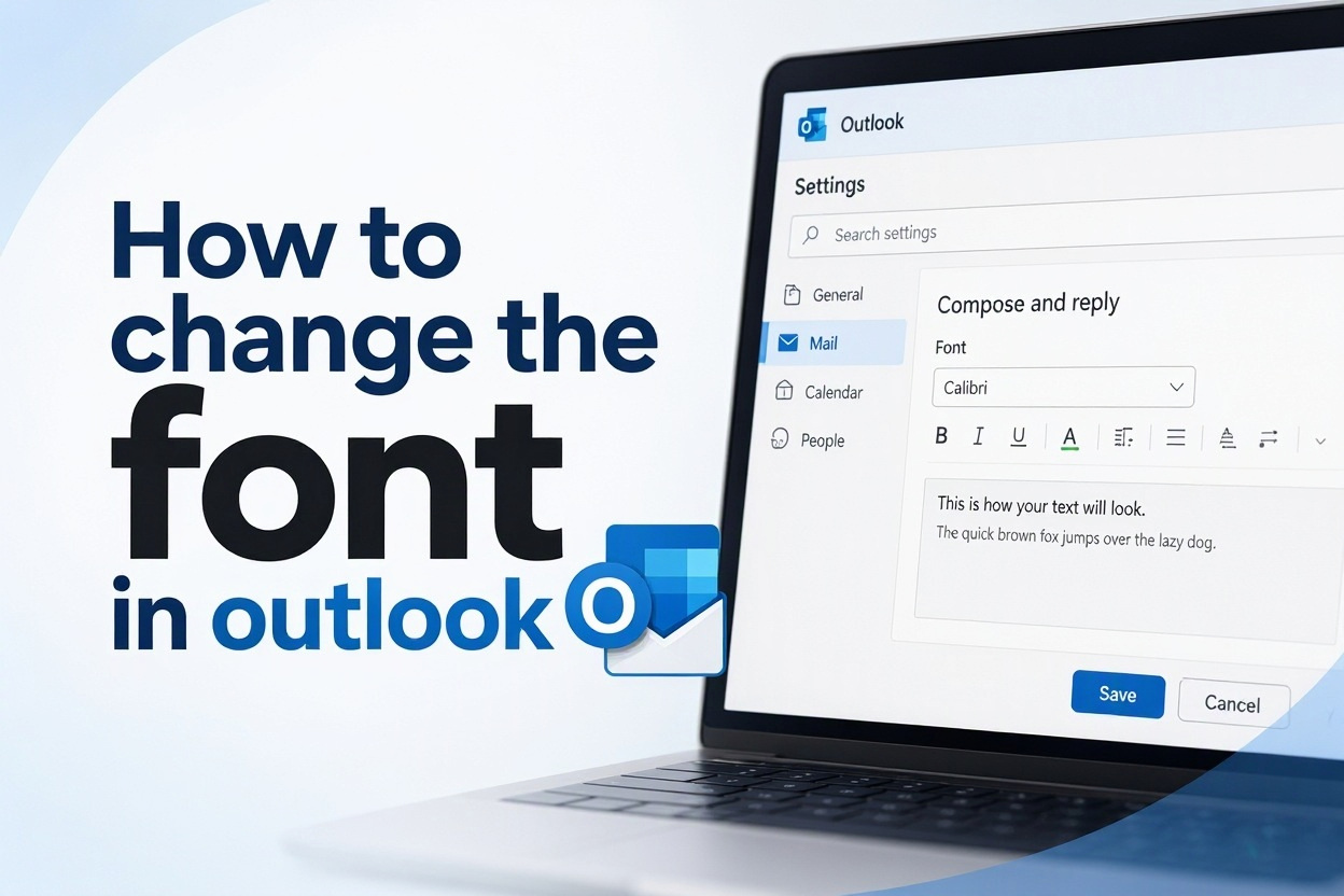
Changing the font in Outlook is a simple way to make your email easier and more comfortable to read. Whether you want larger text, a cleaner typeface, a different color, or a consistent style for new messages and replies, Outlook gives you several options. The exact steps depend on whether you use classic Outlook for Windows, the newer Outlook app, Outlook on the web, or a mobile device. This guide explains how to change the font in Outlook for everyday composing, reading, replying, and forwarding. You will also learn why font settings sometimes do not apply, which choices look professional, and how to avoid common formatting problems when emailing colleagues, clients, friends, or family.
Why Outlook Font Settings Matter
Email formatting affects how clearly your message comes across. A readable default font can reduce eye strain, help recipients scan important details, and make your messages feel polished without becoming distracting.
1. Improve Everyday Readability
A font that is too small or too light can make long emails difficult to read, especially on high-resolution screens. Increasing the font size slightly or selecting a clear typeface can make your inbox and outgoing messages more comfortable to use throughout the day.
2. Create A Consistent Look
Setting a default font means you do not need to format every new message manually. Your emails begin with the same typeface, size, and color each time, which creates a more consistent appearance when you regularly communicate with customers, coworkers, or project teams.
3. Support Accessibility Needs
People have different visual needs. A larger size, stronger contrast, or familiar sans-serif font can make emails easier to read. Adjusting Outlook font settings is a practical personal accessibility choice and does not require changing every other application on your computer.
4. Match Your Communication Style
A clean font can make formal business communication look more organized, while a readable personal font can make everyday emails feel natural. The goal is not to make messages decorative; it is to choose a style that supports the purpose and audience of the email.
5. Separate Writing From Reading
Outlook often lets you choose different settings for composing messages and reading messages. This is useful when you prefer a larger font in your inbox but want outgoing email to use a standard professional size that works well for most recipients.
6. Reduce Repeated Manual Changes
Without default settings, it is easy to forget to resize text or change a hard-to-read style. Setting your preferred font once saves time and helps prevent inconsistent formatting across new emails, replies, and forwarded conversations.
How To Change The Font In Classic Outlook For Windows
Classic Outlook for Windows provides the most detailed font controls. You can set separate fonts for new messages, replies and forwards, and plain-text messages.
1. Open Outlook Options
Open classic Outlook and select File in the upper-left corner. Choose Options from the menu, then select Mail in the left-hand panel. This area contains many composing preferences, including signature, spelling, and stationery settings.
2. Choose Stationery And Fonts
In the Mail settings, locate the Compose Messages area and select Stationery and Fonts. A new dialog box opens with options for changing default themes, fonts, and formatting behavior for different types of outgoing messages.
3. Set The New Mail Font
Under New mail messages, select Font. Choose your preferred font family, style, size, color, and effects. A preview box shows how the text will look. Select a readable choice rather than relying only on the preview’s visual appeal.
4. Set Reply And Forward Fonts
Select Font under Replying or forwarding messages to control the appearance of text you add to an existing conversation. You can use the same style as new messages or choose another setting, although matching them usually creates a cleaner experience.
5. Review Plain-Text Message Settings
Outlook treats plain-text messages differently because they do not support rich formatting. Use the Font button in the Composing and reading plain text messages section to choose how plain-text content appears on your screen.
6. Save Your Choices
Select OK to close the Font dialog, then select OK again to close Stationery and Fonts. Finally, select OK in Outlook Options. Open a new email afterward to confirm that your default writing font has changed as expected.
7. Test A Reply And A Forward
Create a reply to an existing message and forward another message to check those settings separately. If they still use the old font, return to Stationery and Fonts and confirm that you changed each category, not only the new-message option.
How To Change The Font In New Outlook And Outlook On The Web
The newer Outlook experience and Outlook on the web have a simpler settings layout. The available options may vary slightly, but the general process is similar.
1. Open The Settings Menu
Select the Settings icon near the top of Outlook. In some versions, you may need to choose View all Outlook settings at the bottom of the quick settings panel to access the full list of mail preferences.
2. Find Compose And Reply Settings
Open Mail, then select Compose and reply. This page controls the default formatting for messages you write, including font face, size, color, and the option to set a default signature.
3. Select Your Default Font
Use the formatting toolbar in the message format area to choose a font family and size. A familiar sans-serif font is often a safe option because it remains readable across many devices and email applications.
4. Adjust The Font Size Carefully
A standard size is usually easiest for recipients to read and keeps messages from looking oversized. If you need more comfortable text while composing, consider changing the reading display separately rather than making every outgoing message unusually large.
5. Choose A Practical Text Color
Black or a very dark gray is typically the clearest choice for professional email. Colored text may look different in dark mode, on mobile screens, or when a recipient uses accessibility settings, so use it sparingly.
6. Save Before Leaving Settings
Select Save if your version of Outlook displays that option. Some settings pages save automatically, but checking for a confirmation message or reopening the compose window helps ensure your new preference was applied.
7. Check The Result In A New Message
Start a completely new message rather than editing an old draft. Existing drafts and copied content can retain earlier formatting, while a new email is the clearest way to verify the default font setting.
How To Change The Reading Font In Outlook
Changing the font you use when writing does not always change the font you see in the reading pane. If inbox messages are hard to read, adjust Outlook’s display settings as well.
1. Use Zoom For A Single Message
When reading an individual message, use the zoom control if it is available. This is useful when only one email has unusually small text and you do not want to change your broader Outlook settings.
2. Change Reading Pane Settings
In classic Outlook, look for View settings and reading-pane related options. Depending on your Outlook version, you may be able to adjust the font used for the message list, navigation pane, and reading pane separately.
3. Adjust Message List Font
The message list shows senders, subjects, and dates. Increasing this font slightly can make it easier to scan your inbox, especially if you receive many emails each day or use a high-resolution monitor.
4. Use Windows Display Scaling When Needed
If all Outlook text appears too small, the issue may be your device’s display scaling rather than Outlook alone. Adjusting scaling can improve readability in Outlook and other applications without forcing overly large outgoing email text.
5. Consider Dark Mode Contrast
Dark mode can be easier on the eyes, but custom email colors may appear differently against a dark background. Test your preferred reading mode to ensure sender names, subject lines, and message text remain easy to distinguish.
6. Keep Accessibility In Mind
A clear font, adequate size, and strong contrast provide a better experience than decorative formatting. These choices are especially useful if you read messages for long periods or share a device with someone who has different visual preferences.
7. Avoid Confusing Display Changes With Email Formatting
A change to the reading pane affects what you see locally. It does not force recipients to see an email in that font. Your writing font, the recipient’s email client, and the message format all influence the final appearance.
Choosing A Professional Outlook Font
The best Outlook font is usually one that disappears into the background. Recipients should notice the message, not the typeface.
1. Choose Familiar Fonts
Common fonts are less likely to be replaced by another font on the recipient’s device. A simple, widely supported font helps preserve the intended appearance of your message across different email platforms.
2. Prioritize Clarity Over Personality
Script, novelty, and overly condensed fonts can be difficult to read quickly. They may be suitable for a rare personal invitation, but they are not ideal for routine workplace messages, client communication, or detailed instructions.
3. Use A Moderate Size
Text that is too small makes readers strain, while text that is too large can look forceful or unbalanced. A moderate size generally works best for everyday email and leaves room for headings, bullet points, or short emphasis where needed.
4. Limit Color Choices
Dark text on a light background remains dependable. Bright colors can reduce readability, create contrast problems, and appear unprofessional in formal emails. If you need emphasis, use short, clear wording rather than relying on color alone.
5. Keep Replies Consistent
Using a similar font for new emails, replies, and forwarded messages makes conversations easier to follow. Consistency is especially helpful in long email threads where several people may add comments over time.
6. Respect Company Requirements
Some organizations have email templates, signatures, or branding rules. Your personal Outlook font setting should not conflict with those expectations. When in doubt, use the style preferred by your team or the template supplied by your organization.
7. Consider Mobile Readers
Many emails are read on phones. A clean font, short paragraphs, and modest formatting usually travel better to small screens than highly customized text. Test important messages with mobile readability in mind before sending them.
Common Outlook Font Problems And Mistakes
Font settings can seem confusing because Outlook supports multiple message formats, applications, and display preferences. These common issues explain why changes may not look the way you expect.
1. Changing Only New Messages
A frequent mistake is updating the font for new messages but not for replies or forwarded emails. These are separate settings in classic Outlook, so your reply may continue using the old style until you update that category as well.
2. Formatting Copied Text
Text copied from websites, documents, or other emails often carries its own formatting. Even when you have set a default font, pasted content may retain a different typeface, size, color, spacing, or background appearance.
3. Expecting Recipients To See Identical Fonts
Recipients may use a different operating system, app, browser, display mode, or accessibility setting. If the chosen font is unavailable on their device, their email program may substitute another font while preserving the message content.
4. Using Too Many Font Effects
Bold, colored, underlined, enlarged, and styled text in the same message can make information harder to scan. Reserve emphasis for the most important points and allow plain, well-written sentences to do most of the communication work.
5. Forgetting Plain-Text Limits
Plain-text email does not support the same formatting as HTML email. If a message is sent or converted as plain text, Outlook may remove font styles and colors. This is normal behavior, not necessarily a settings failure.
6. Changing The Wrong Outlook Version
Instructions for classic Outlook, new Outlook, mobile Outlook, and Outlook on the web do not always match. Before troubleshooting, identify the version you are using and look for settings within that specific application.
7. Overriding A Shared Template
Some teams use templates or signatures that apply formatting automatically. Changing the default font may not alter text inserted by those tools. Check the template itself if only certain parts of a message keep returning to an old font.
Best Practices For Outlook Email Formatting
Good font settings support clear communication without adding unnecessary visual noise. These habits help keep your Outlook messages readable and consistent.
1. Use One Default Font Family
Choose one reliable font for most new messages and keep it as your default. Switching fonts from one email to another can make routine communication look inconsistent and gives recipients one more visual detail to process.
2. Keep Important Messages Simple
For job applications, customer updates, meeting decisions, and formal requests, simple formatting is usually strongest. Use a readable font, normal size, short paragraphs, and clear subject lines rather than elaborate formatting effects.
3. Use Bold With Purpose
Bold text can highlight a deadline, requested action, or key decision. Use it for a small number of words rather than full paragraphs. Too much bold text has the opposite effect because nothing stands out clearly.
4. Check Pasted Content Before Sending
After pasting text into Outlook, review the font, line spacing, colors, and indentation. If the copied material looks inconsistent, use Outlook’s formatting controls to return it to your preferred style before sending.
5. Preview Emails With Care
Before sending an important message, scan it as a recipient would. Check that the font is comfortable to read, paragraphs are not too dense, and any emphasis still makes sense without relying solely on color or size.
6. Keep Signatures Separate From Body Text
A signature may use company-approved formatting that differs slightly from your message body. That is normal. Avoid manually changing the signature every time unless you have been asked to use a specific branded format.
7. Review Settings After Updates
Outlook updates, account changes, or moving between classic and new Outlook can affect where settings appear. If your font changes unexpectedly, revisit your composing settings and confirm that your preferred options are still saved.
Practical Uses For Different Outlook Font Settings
Different situations can call for slightly different font choices, but readability should remain the priority in every case.
1. Everyday Workplace Messages
For regular updates to coworkers, use a consistent, straightforward font and size. This keeps routine messages easy to read and makes your writing look dependable without requiring extra formatting effort each time you compose an email.
2. Client And Customer Emails
External communication benefits from restrained formatting. Choose a professional font, dark text, and clear spacing. The message should look organized on different devices and should not depend on special styling to explain key information.
3. Long Project Updates
Longer updates can benefit from a readable font and brief sections. Use headings or short labeled lines where appropriate, but avoid mixing several fonts. Consistency helps readers find actions, dates, risks, and next steps more quickly.
4. Personal Correspondence
Personal emails allow more flexibility, but clear text is still helpful. You can select a font that feels comfortable and friendly while avoiding unusual styles that may not display well when friends or family open messages on different devices.
5. Accessibility-Focused Communication
When writing for someone who may find small text difficult, a slightly larger, high-contrast font can be considerate. Keep the message organized and avoid relying only on color to indicate meaning, urgency, or a requested action.
6. Shared Mailboxes
A shared team mailbox should usually follow a common formatting style. Individual employees may have personal preferences, but a shared default helps replies appear consistent and prevents customers from receiving noticeably different-looking messages from the same address.
7. Temporary Formatting Needs
Sometimes one message needs a different size or emphasis, such as an urgent operational notice. Make those changes only for that email instead of changing global settings, then return to your normal professional default for everyday communication.
Frequently Asked Questions
1. Can I Change The Font For New Emails In Outlook?
Yes. In classic Outlook for Windows, open File, Options, Mail, and then Stationery and Fonts. In new Outlook or Outlook on the web, open Settings and look for Compose and reply. Choose your preferred font and save the change before opening a new message.
2. Why Does Outlook Keep Using The Old Font?
You may have changed only the new-message setting, while replies and forwards use separate options. Another possibility is that you are editing an existing draft or pasting formatted text. Start a new email and test each message type after saving your settings.
3. Can I Change The Font Size In Outlook Without Affecting Recipients?
Yes, if you change only your reading view, zoom level, or display scaling. Those options affect how messages look on your device. Changing the default composing font, however, affects the formatting you send, although recipients may still see substitutions in their own email app.
4. What Is The Best Font For Professional Outlook Emails?
A common, clean sans-serif or serif font in a moderate size is generally a good choice. The best option is one that is readable, widely supported, and not distracting. Consistency, good contrast, and clear writing matter more than selecting a distinctive typeface.
5. Does Outlook Mobile Let Me Change The Default Font?
Outlook mobile generally offers fewer formatting controls than desktop or web versions. You may be able to format text while composing in some versions, but broad default font options can be limited. Check the app settings and use the desktop or web version for more control.
6. Why Does My Font Change When I Paste Text Into Outlook?
Copied text often includes hidden or visible formatting from its original source. That formatting can override your default Outlook font. After pasting, select the text and apply your preferred font, or use a paste option that keeps only the plain text when available.
Conclusion
Learning how to change the font in Outlook helps you create emails that are easier to read and more consistent. Start by identifying your Outlook version, then adjust the settings for new messages, replies, forwards, and reading views as needed. Remember that these settings may work differently in classic Outlook, new Outlook, web Outlook, and mobile apps.
Choose a simple, readable style, use formatting sparingly, and check pasted text before sending important messages. A thoughtful default font does not replace clear writing, but it supports it by making your communication more comfortable for both you and your recipients.
Discussion