
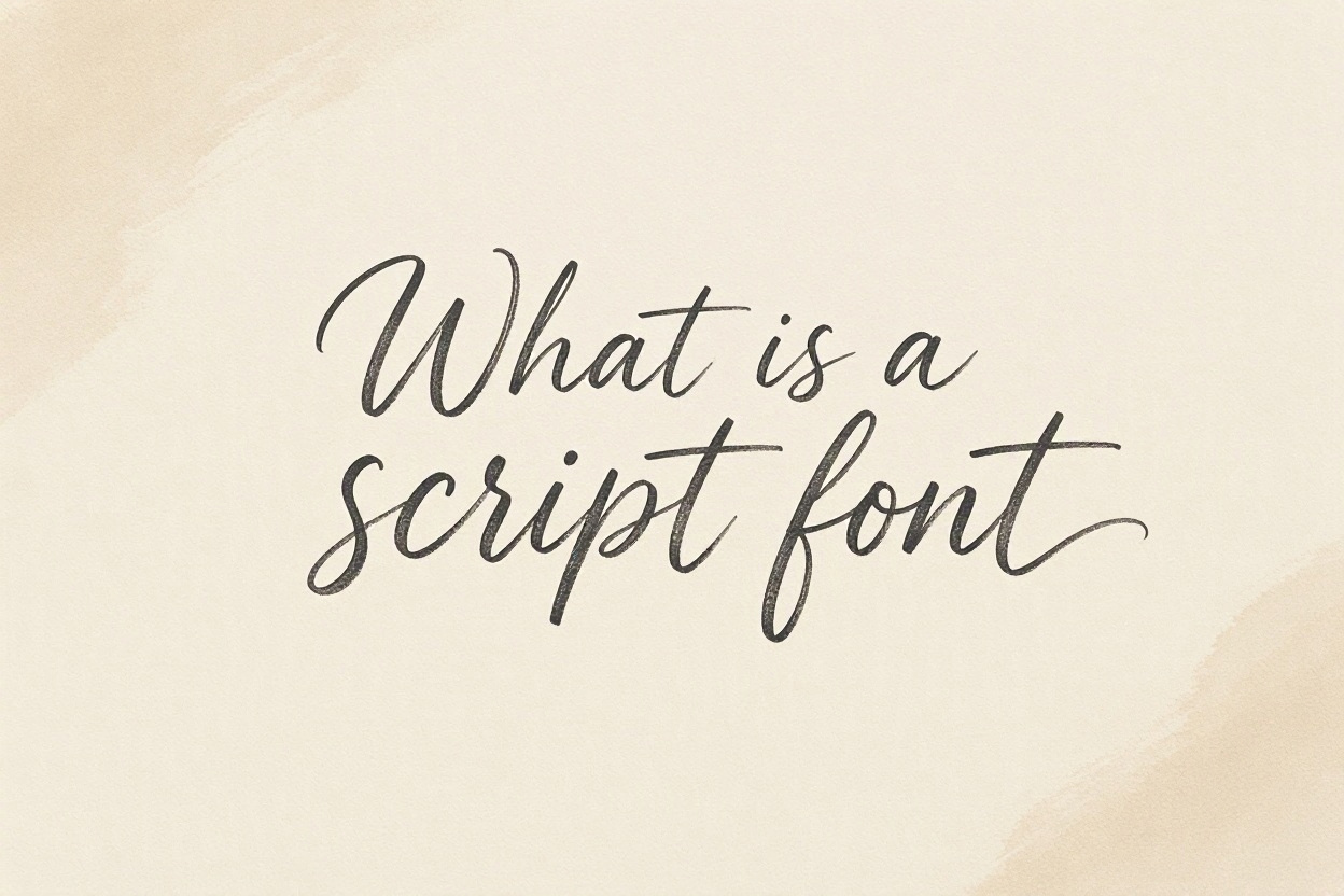
A script font is a typeface designed to look like handwriting, calligraphy, or hand-drawn lettering. It may feel elegant, friendly, artistic, casual, or highly personal depending on its style. You often see script fonts on wedding invitations, product packaging, social media graphics, restaurant menus, logos, and greeting cards. Their flowing strokes can add personality that a standard printed typeface may not provide. However, choosing and using a script font well takes care. Some are easy to read at large sizes, while others become difficult to read in long paragraphs or on small screens. This guide explains what makes a script font unique, why it matters in design, where it works best, how to choose one, and the mistakes to avoid.
Script Font Meaning And Core Features
Script fonts are built around the visual qualities of handwriting. They range from formal letterforms inspired by traditional penmanship to loose styles that resemble a quick marker signature.
1. Handwritten Appearance
The defining feature of a script font is its handwritten look. Letters may connect, tilt, vary in width, or include swashes that imitate the movement of a pen or brush. This human quality can make a design feel warmer and less mechanical than a plain sans-serif or serif typeface.
2. Flowing Letterforms
Many script fonts use connected letters or strokes that seem to flow from one character to the next. This movement creates a sense of rhythm and elegance. Not every script typeface connects every letter, but a flowing baseline and curved forms are common visual signals.
3. Variable Stroke Thickness
A script font often has thick and thin strokes, similar to marks made with a flexible nib, brush, or marker. The contrast may be subtle in casual handwriting styles or dramatic in formal calligraphy. Stroke variation gives the typeface texture and helps it feel expressive.
4. Decorative Details
Script letterforms can include flourishes, loops, long tails, entry strokes, and exit strokes. These details add visual interest, especially in display text. They also take up space, so designers should use them carefully when working with tight layouts or small type sizes.
5. Personal Tone
Because script type resembles a person writing by hand, it can suggest personality quickly. A delicate calligraphic style may feel romantic and refined, while a bold brush script can feel energetic and modern. The tone of the font should match the message and audience.
6. Display-Focused Design
Most script fonts work best as display type rather than body text. They are usually strongest in headlines, names, short phrases, and accents. Longer passages set in script can slow reading because the detailed shapes demand more attention from the reader.
Types Of Script Fonts
Script typefaces are not all alike. Knowing the main categories makes it easier to choose a style that supports the mood of a project.
1. Formal Calligraphy Scripts
Formal calligraphy scripts are based on traditional handwriting created with pointed pens or broad nibs. They often feature graceful curves, strong thick-and-thin contrast, and carefully shaped capitals. These fonts are suitable for luxury branding, formal invitations, certificates, and sophisticated editorial details.
2. Casual Handwriting Scripts
Casual handwriting scripts look more relaxed and natural, as if someone wrote the words with a pen. Their letters may be less polished and more uneven by design. They are useful for friendly brands, personal notes, craft projects, informal packaging, and approachable social posts.
3. Brush Script Fonts
Brush script fonts imitate lettering made with a paintbrush, brush pen, or broad marker. They often have bold strokes, visible texture, and lively movement. This category can give posters, apparel graphics, food packaging, and promotional designs a confident, energetic character.
4. Signature Scripts
Signature scripts are designed to resemble a quick personal signature. They are usually narrow, slanted, and fluid, with simplified letter shapes. They can add a premium or intimate touch to a logo, product label, photography watermark, or personal-brand design when used sparingly.
5. Vintage Scripts
Vintage scripts draw inspiration from old signage, advertising, menus, and packaging. They may use bold connected letters, retro swashes, and decorative forms. These fonts can be effective for heritage brands, cafés, barbershops, sports-inspired graphics, and projects that need a nostalgic feeling.
6. Monoline Scripts
Monoline scripts keep their strokes at a more consistent thickness. They usually feel cleaner and simpler than highly calligraphic styles, which can improve readability. This makes them a practical choice for modern branding, labels, short digital captions, and friendly interface accents.
Why Script Fonts Matter In Design
A script font can do more than decorate a page. It helps establish a visual voice before the reader has finished the first word.
- Creates Emotion: Script lettering can communicate romance, joy, comfort, celebration, creativity, or confidence through its shapes and movement.
- Builds Brand Personality: A distinctive handwritten style can help a small business or personal brand feel memorable and recognizable.
- Adds Visual Contrast: Pairing a script font with a simple supporting typeface creates hierarchy and gives important words more attention.
- Supports Storytelling: Handwritten type can make a message feel personal, crafted, nostalgic, or connected to a real person.
- Highlights Key Text: Used for a name, slogan, or short phrase, a script font can guide the viewer toward the most important information.
- Improves Mood Matching: Different script styles make it easier to align typography with an event, product, season, or brand promise.
How To Choose A Script Font
The right script font should look attractive and remain useful in its intended setting. A simple review process prevents a visually appealing choice from becoming a readability problem.
- Define The Desired Mood: Decide whether the project should feel elegant, playful, handmade, bold, relaxed, or nostalgic before comparing styles.
- Identify The Main Use: Consider whether the typeface will appear in a logo, headline, invitation, label, social graphic, or printed sign.
- Test The Actual Words: Type the real name, phrase, or headline instead of judging the font only from its sample alphabet.
- Check Readability: Look at the text from a normal viewing distance and make sure each word remains clear without effort.
- Review Capital Letters: Script capitals can be beautiful but complex, so test them carefully in names and short titles.
- Pair With A Simple Font: Use a clear serif or sans-serif font for supporting details, descriptions, dates, and calls to action.
- Test Multiple Sizes: A script font that looks strong in a large heading may become cramped or unclear in small print.
Script Font Use Cases
Script typefaces are most effective when their personality supports the purpose of the design. These common uses show how they can add value without taking over the entire layout.
1. Wedding Stationery
Script fonts are a natural fit for wedding invitations, save-the-date cards, place cards, and thank-you notes. A formal script can make names feel special and ceremonial, while a clean supporting font keeps dates, locations, and practical information easy to read.
2. Beauty And Lifestyle Brands
Beauty, skincare, boutique, and lifestyle brands often use script lettering to suggest care, softness, confidence, or personal attention. A refined script can work well for a logo or product line name, provided that packaging details use a simpler typeface for clarity.
3. Food And Drink Packaging
Script fonts can make food and drink packaging feel handmade, flavorful, nostalgic, or premium. A café may use a brush script for a seasonal drink name, while a bakery may choose a casual handwritten style to emphasize a home-baked feeling.
4. Social Media Graphics
A script font can add visual variety to social media posts, especially for short quotes, announcements, sale messages, and personal updates. Keep the script text brief and high contrast. On small screens, too much decorative lettering can quickly become difficult to read.
5. Logos And Personal Brands
Creative professionals sometimes use a signature-style script in their logo to make the business feel personal. It can work for photographers, artists, stylists, and consultants, but the logo should still be recognizable at small sizes and in a single color.
6. Event Signage
Script fonts can bring personality to welcome signs, menus, seating charts, milestone boards, and party décor. Large lettering gives the font room to breathe. Important directions, prices, and schedules should remain in a straightforward supporting typeface for practical reading.
Script Font Pairing Principles
Pairing is one of the most important parts of using script typography. A well-chosen companion font makes the script look intentional rather than overwhelming.
1. Choose A Clear Supporting Typeface
Pair a script font with a readable serif or sans-serif typeface that has a simpler structure. The supporting font should handle longer text and practical details. This contrast lets the script remain expressive without forcing readers to work through decorative letterforms everywhere.
2. Limit The Number Of Typefaces
Using too many fonts can make a design feel scattered. In many cases, one script font and one supporting typeface are enough. Add a third only if it has a clear job, such as a small label style or a bold display accent.
3. Create Contrast In Weight
Contrast can come from weight as well as style. A delicate script may pair well with a medium or bold sans-serif, while a heavy brush script often needs a lighter, cleaner companion. The goal is balance, not competition between the typefaces.
4. Use Size To Establish Hierarchy
Script lettering usually works best when it is larger than the supporting text. Give it enough space to show its character, then use smaller simple text for information that readers need to scan quickly. This creates a clear path through the layout.
5. Respect Spacing
Decorative letters need room around them. Tight line spacing, crowded margins, and overlapping swashes can make a script font look messy. Check how letters behave beside each other, especially around capital letters, punctuation, and descenders that extend below the baseline.
6. Match The Historical Feel
A type pairing should feel consistent with the project’s overall tone. A vintage sign-inspired script may look natural beside a classic serif, while a clean monoline script may work better with a modern geometric sans-serif. Mismatched eras can create unintended visual tension.
Common Script Font Mistakes To Avoid
Script fonts are memorable, but they can become less effective when decoration is valued more highly than clear communication.
1. Using Script For Long Body Copy
Long paragraphs in a script font are tiring for most readers. Connected letters, decorative flourishes, and irregular shapes slow the eye down. Reserve script typography for a short title, name, or emphasis, and use a simpler font for descriptions and detailed information.
2. Choosing Style Over Readability
A font can look beautiful in a preview and still fail in real use. Test the exact words, especially names, prices, dates, and calls to action. If a reader has to guess at a letter, choose a clearer script or simplify the layout.
3. Using Too Many Flourishes
Swashes and loops can add elegance, but too many make text look crowded and theatrical. Decorative alternatives should support a focal word rather than appear on every line. Use them with restraint so the typeface retains its charm and the message stays readable.
4. Ignoring Small-Screen Viewing
Fine details that look attractive on a desktop monitor may disappear on a phone. Always preview a digital design at a realistic small size. Increase contrast, reduce the number of script words, or select a sturdier font if the message loses clarity.
5. Poor Color Contrast
Thin script strokes need strong contrast against the background. Light lettering on a busy photograph or pale color combinations can make the text vanish. Place script type on a calm background or add a simple solid area behind it when readability matters.
6. Forgetting Licensing Requirements
Not every font can be used in every project. Some licenses limit commercial use, web use, app use, or distribution in templates. Review the license before publishing a logo, product, client design, or marketing campaign to avoid preventable legal and financial problems.
Best Practices For Script Font Design
Effective script typography is usually simple, deliberate, and carefully tested. These practices help keep the design attractive while protecting usability.
1. Keep Script Text Short
Use a script font for a few meaningful words rather than entire messages. Names, product titles, short quotes, and brief taglines are ideal. Short text gives the letterforms room to be expressive while ensuring readers can quickly recognize the intended words.
2. Start With The Message
Choose the message before choosing the font. A cheerful announcement, a luxury invitation, and a retro menu require different visual voices. When the purpose is clear, it becomes easier to select a script style that supports the content rather than distracting from it.
3. Test In Context
Place the font inside the actual layout before making a final decision. Test it with the real background, color palette, supporting text, and available space. Context reveals issues with contrast, hierarchy, and spacing that an isolated font preview may hide.
4. Use Open Space Generously
Script fonts often have expressive shapes that need visual breathing room. Leave clear margins around headlines and avoid placing busy elements too close to long swashes. Open space makes the lettering look more intentional and helps the reader focus on the message.
5. Adjust Letter Spacing Carefully
Some scripts need slight spacing adjustments, especially when used in all caps or with short words. However, excessive letter spacing can break the natural handwritten rhythm. Make small changes only after checking whether the original design already handles spacing effectively.
6. Prioritize Accessibility
Typography should help people access information, not create a barrier. Avoid using decorative script for essential instructions, legal details, navigation, or small labels. Clear type, adequate size, and strong contrast make the design more inclusive for a wider range of readers.
How Script Fonts Affect Brand Perception
Typography shapes first impressions because people react to visual tone quickly. A script font can make a brand seem personal before the audience reads the supporting message.
Elegant scripts often suggest ceremony, quality, romance, or a premium experience. This can suit a florist, jeweler, wedding planner, or boutique brand, particularly when the rest of the visual system is clean and restrained.
Casual scripts can signal warmth, creativity, humor, and an informal human touch. They are useful for makers, small cafés, family-focused products, and community businesses that want to feel approachable rather than corporate.
Bold brush scripts can feel active and expressive. They may support brands connected to food, music, sports, streetwear, or creative services, but their strong personality should be balanced with clear structure and plenty of space.
The best choice is not simply the most attractive typeface. It is the one that consistently reflects the brand’s values, audience expectations, and practical communication needs across different sizes and formats.
Frequently Asked Questions
1. Is A Script Font The Same As Cursive?
Script fonts and cursive writing are closely related, but they are not exactly the same thing. Cursive refers to a handwriting method where letters often connect. A script font is a designed typeface that may imitate cursive, calligraphy, brush lettering, or signature-style writing.
2. Are Script Fonts Good For Logos?
Script fonts can work very well for logos when the brand needs a personal, elegant, artistic, or handmade feel. The main requirement is readability at different sizes. Test the logo on small labels, mobile screens, and simple one-color versions before committing to the design.
3. Can I Use A Script Font For Body Text?
It is usually better not to use a script font for body text. Long passages become harder to scan because decorative letters and connecting strokes slow reading. Use script type for headlines or accents, then choose a clear serif or sans-serif font for paragraphs.
4. What Font Goes Well With A Script Font?
A simple sans-serif or readable serif font usually pairs well with a script font. The companion typeface should provide contrast without looking unrelated. Choose a font that can handle detailed information, and let the script take responsibility for the expressive focal text.
5. Why Do Some Script Fonts Look Hard To Read?
Some script fonts use very thin strokes, exaggerated loops, unusual letter shapes, or tightly connected characters. These details can be attractive at large sizes but confusing in small text. Readability also drops when color contrast is weak or the background is visually busy.
6. How Many Script Fonts Should I Use In One Design?
One script font is usually enough for a single design. Combining several script styles often creates visual clutter because each one has its own rhythm and personality. Pair one script with one simple supporting typeface to create a cleaner hierarchy and more consistent result.
Conclusion
A script font is a handwriting-inspired typeface that can add personality, emotion, and visual distinction to a design. Its flowing forms make it especially useful for short, important text such as names, headlines, logos, invitations, and packaging details.
The strongest results come from choosing a style that matches the message, pairing it with a clear supporting font, and protecting readability at every size. When used with restraint, script typography feels expressive without making information difficult to understand.
Discussion